
Back

MEILYNE

MEILYNE is a startup fashion and leather goods brand based in Paris. Launched by Miss Île-de-France 2019 and ex-engineer Evelyne de Laurichaudy, the brand aims to empower women by creating high-quality bags and accessories inspired by asian culture, architecture, building engineering and french lifestyle.

In the goal of expanding the brand globally and maturing its visual identity, I worked with MEILYNE to develop their creative direction and visual world across branding, website and campaigns.

Explore Project

Period

06.2026 → 08.2026

Services

Creative DirectionBrandingUI/UX DesignPrototypingPhotographyPhoto EditingContent Creation

Tools

MEILYNE

The brand

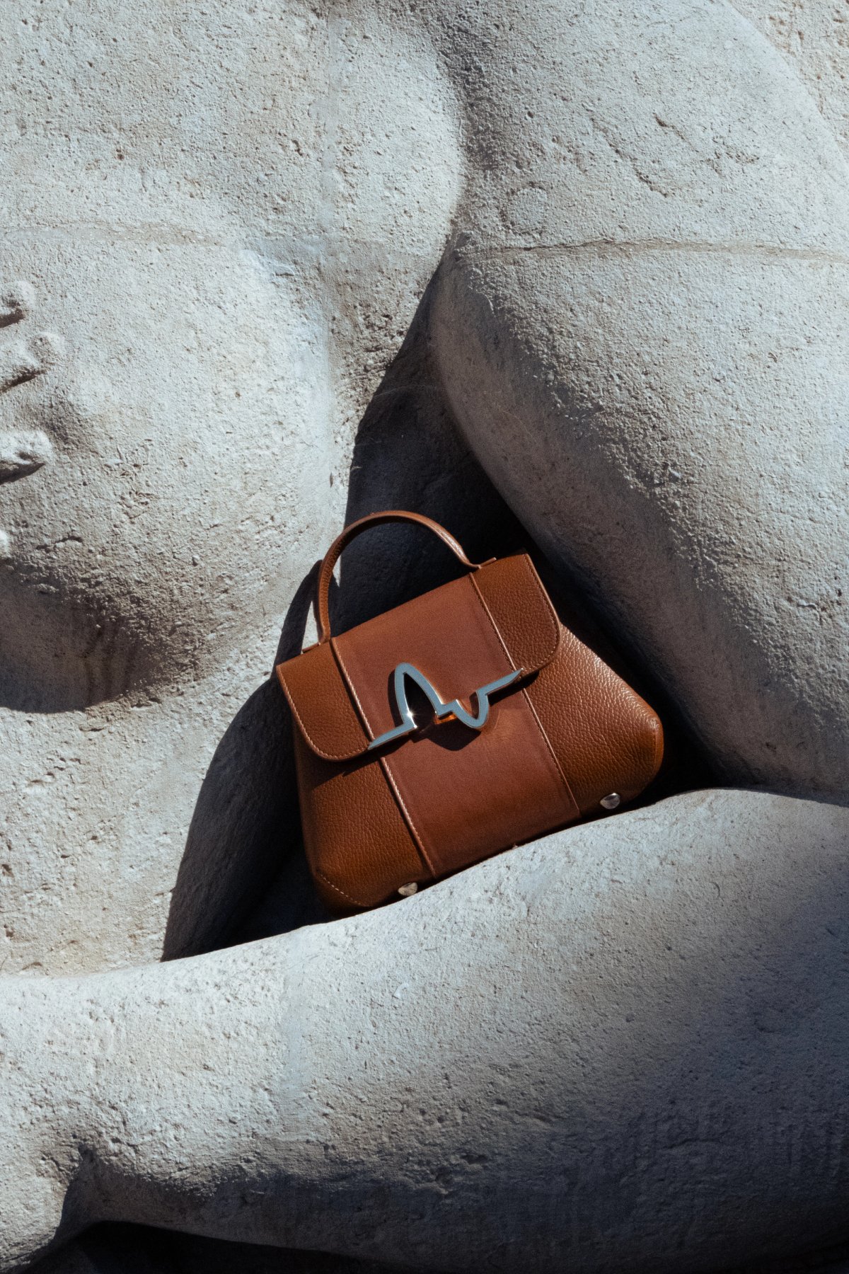
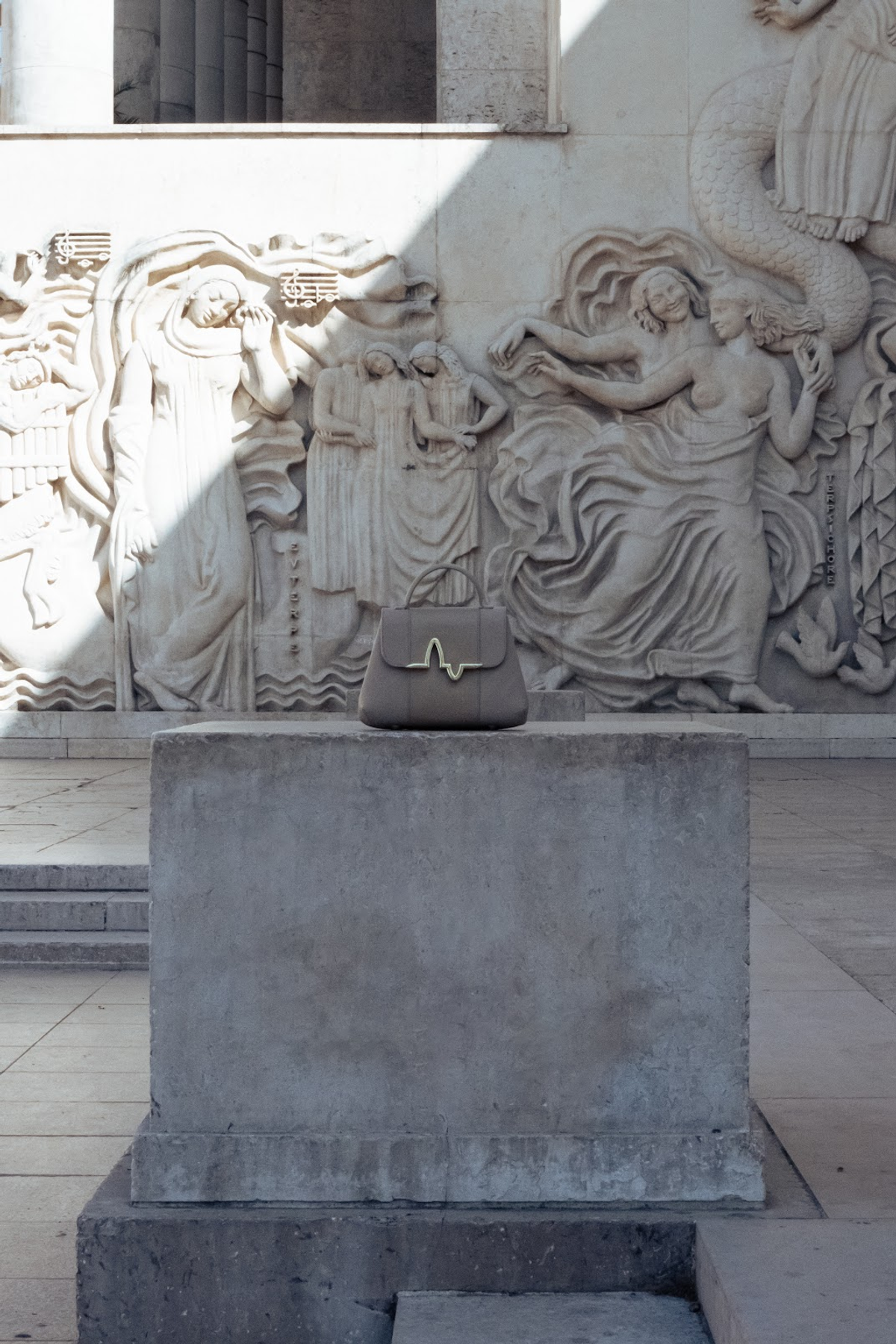
Inspired by the logic of architecture and the codes of haute couture, MEILYNE is the brainchild of Evelyne de Larichaudy, a structural engineer. Her engineering perspective and cultural diversity give rise to bags in which precision of construction meets elegance of design, making each bag a piece that is both intellectual and aesthetically pleasing.

© Mariette Garault
© Mariette Garault

Creative Direction

At the heart of MEILYNE’s visual identity lies the idea of linking the brand’s various sources of inspiration with its audience and its products. As the brand embodies the connection between different worlds (architecture, engineering, fashion, inspiring women and asian culture), its visual identity aims to reflect these worlds in an interwoven and coherent manner.

© Mariette Garault
© Mariette Garault
© Mariette Garault
© Mariette Garault

Visual Identity

The monogram, the brand’s symbol at the heart of its identity, is distinguished by a central section featuring an organic motif.

This wavy form subtly evokes cloth and its suppleness, but also a contemporary and experimental style of architecture that breaks with convention: a rigorous, meticulously designed structure, into which a sophisticated and expressive composition is integrated.

Furthermore, this undulating shape also symbolises a connection; the brand represents the bridge between elegance and technology – fashion and architecture.

This connection also reflects the brand’s desire to bring together ambitious women and to support and inspire them in their endeavours.

MEILYNE new color scheme is inspired by various materials used in asian culture, construction and french flora.

Graphic elements

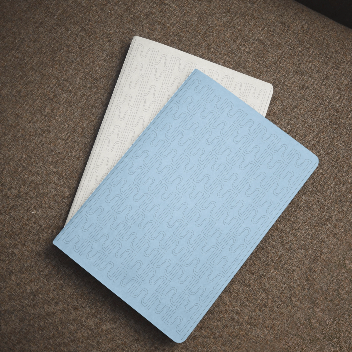
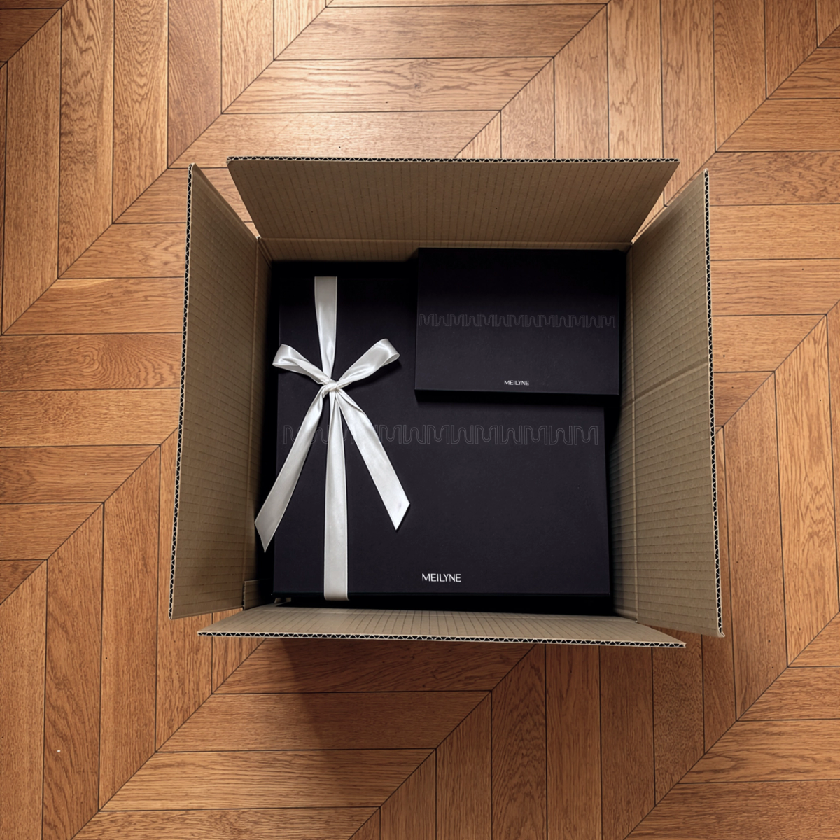
Le Motif is a graphic pattern comprising several MEILYNE monograms arranged side by side. Recalling both a Hippodamian grid and a façade pattern, it can be used to form either a grid or a frieze.

Le Tracé is a lighter graphic element reminiscent of the lines found on a technical drawing or a garment pattern. It can be used to frame or separate content whilst lending a schematic and structured appearance.

0:00
The visual toolkit website developed to help in generating brand visuals easily and quickly.

Website

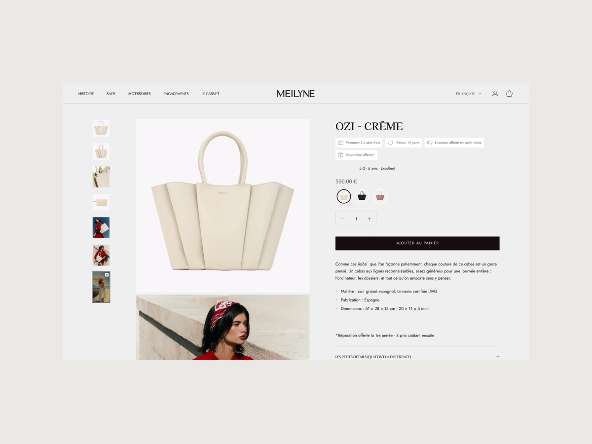
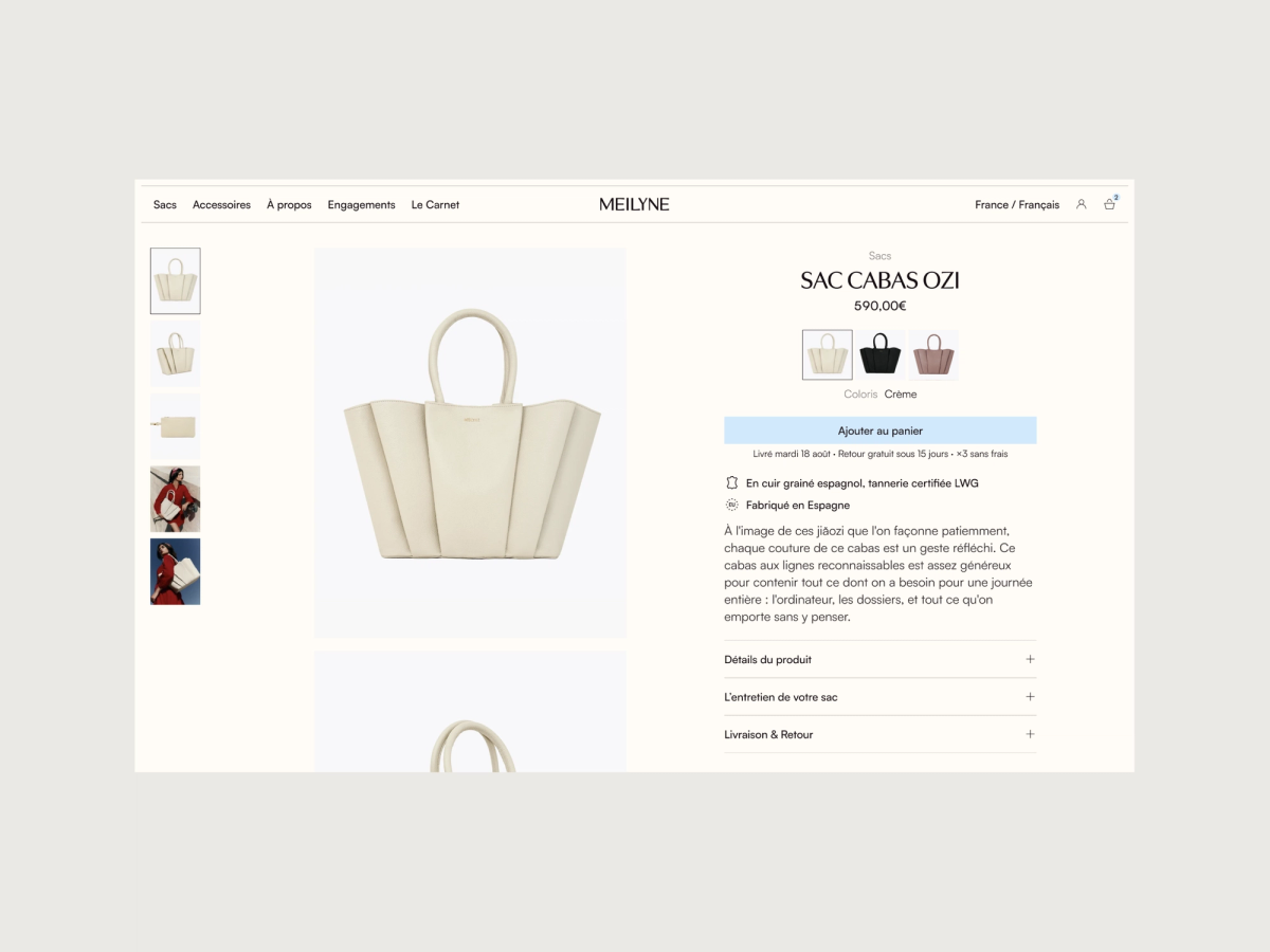
The new e-commerce website adopts this new identity with plays on the layout - including Le Tracé to highlight main content and Le Motif as a signature - and leaning on a more visual-driven design approach.

0:00

The new experience was both a work of design and experience. In this new website, the content balances between clear texts, CTA and showcase visuals.

The whole website structure and user journey was taken up from a global perspective to make the website more intuitive, cohesive and clearer - both visually and informationally.

Old product page
New product page

Photography

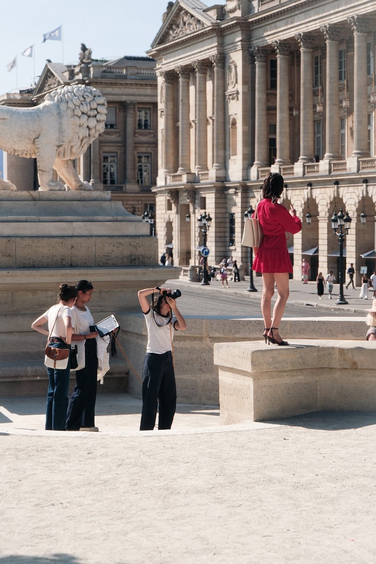
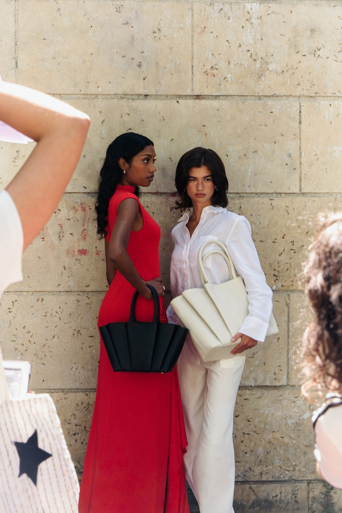
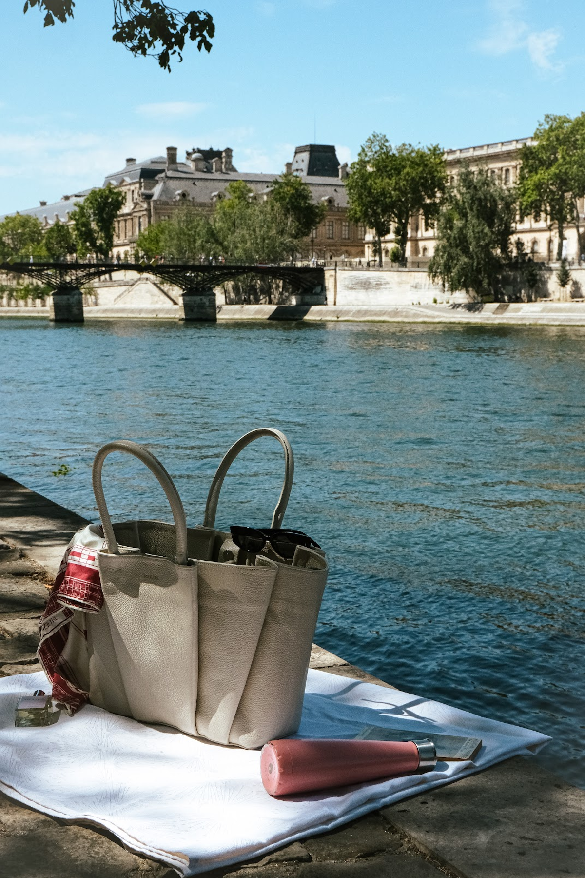
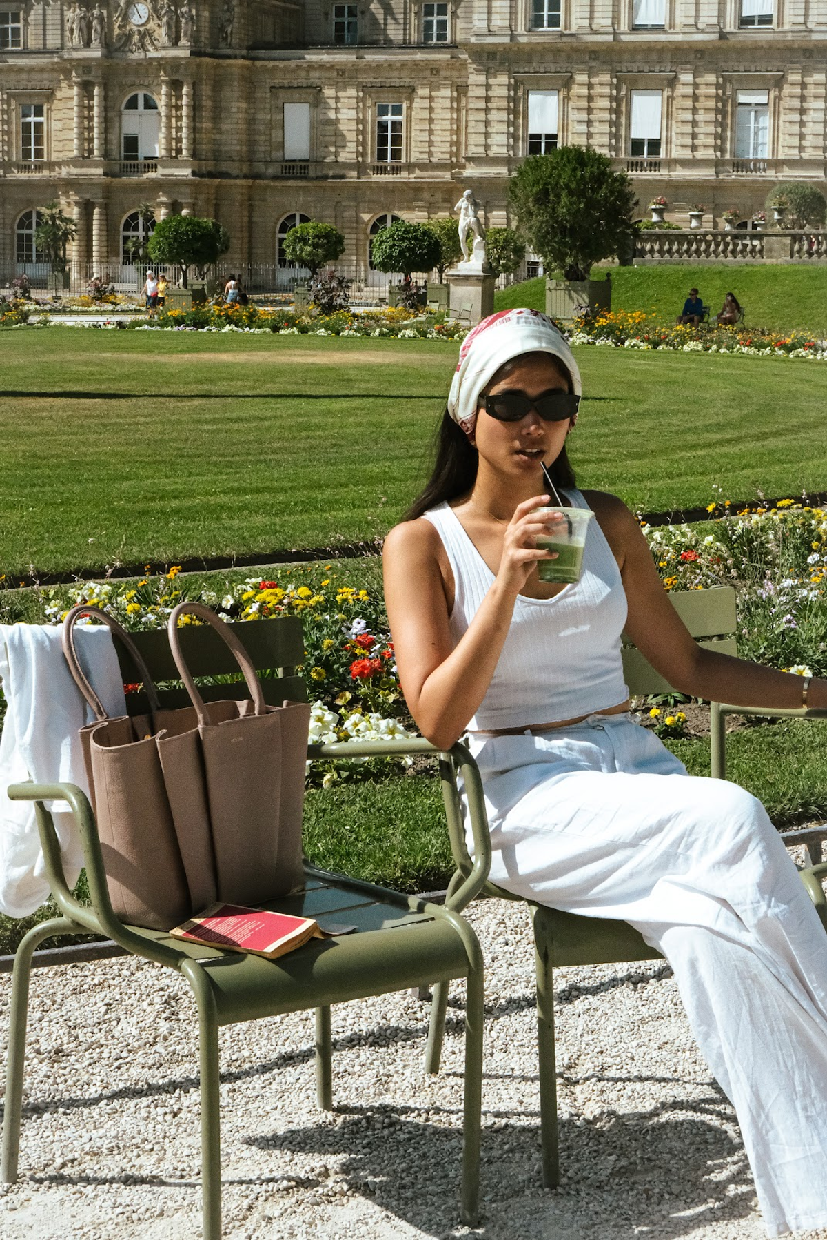
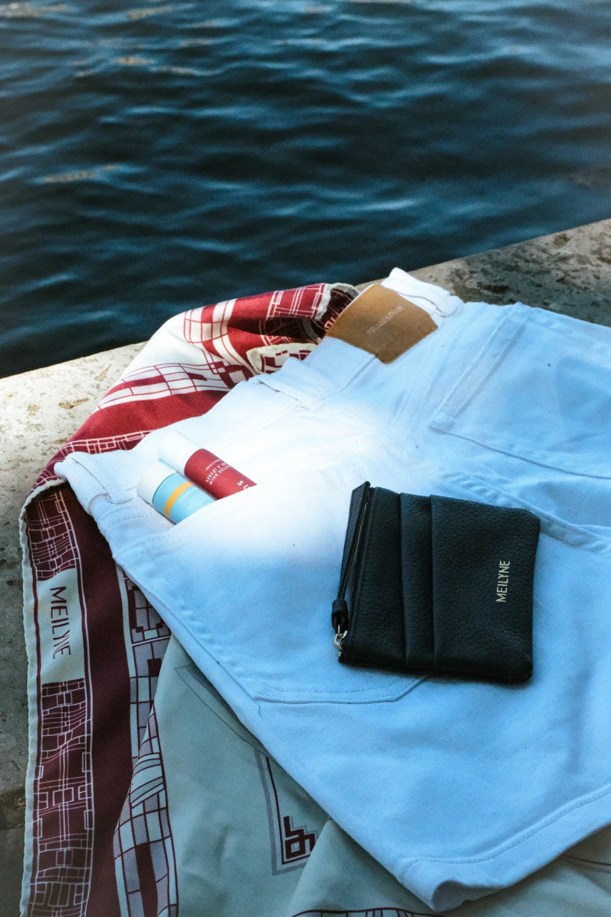
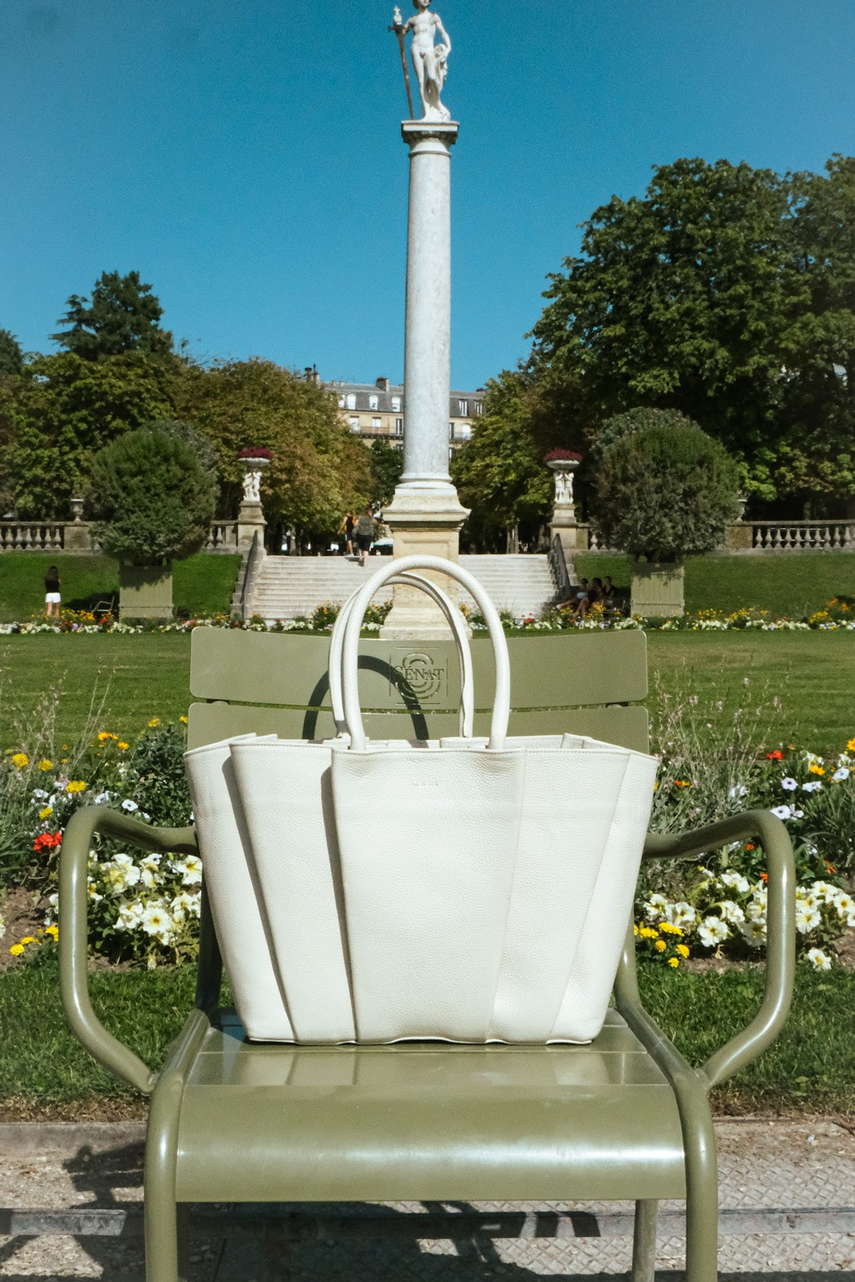
The brand also wanted to introduce their new image via a couple of new campaigns throughout the summer.

I was committed by the brand to produce a couple of behind-the-scenes, product and miscellaneous visuals that capture the mood and work behind MEILYNE.